Motel 6
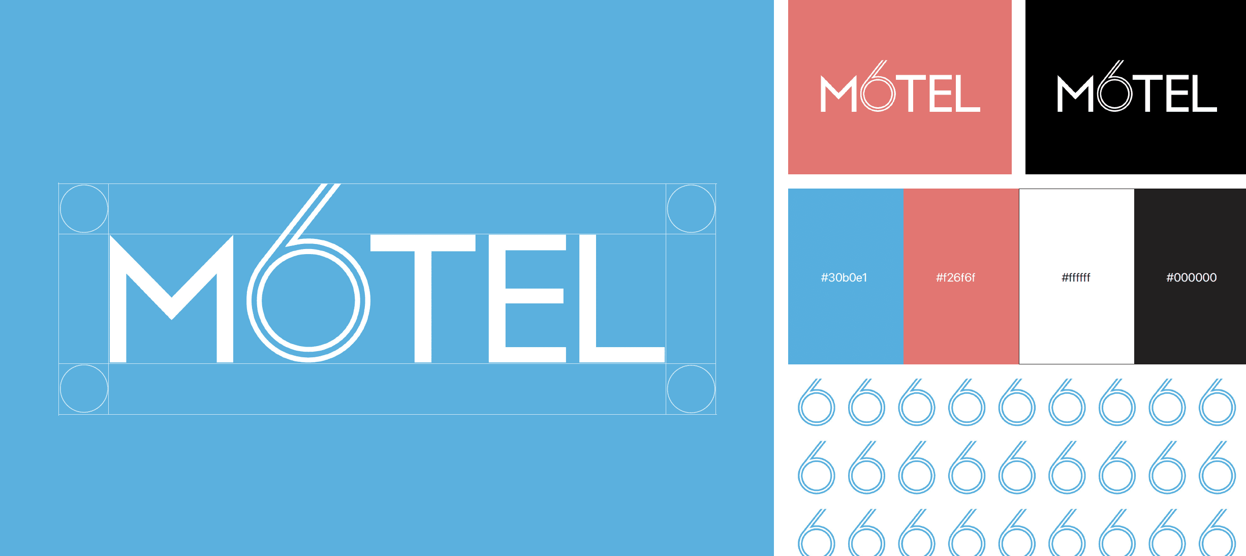
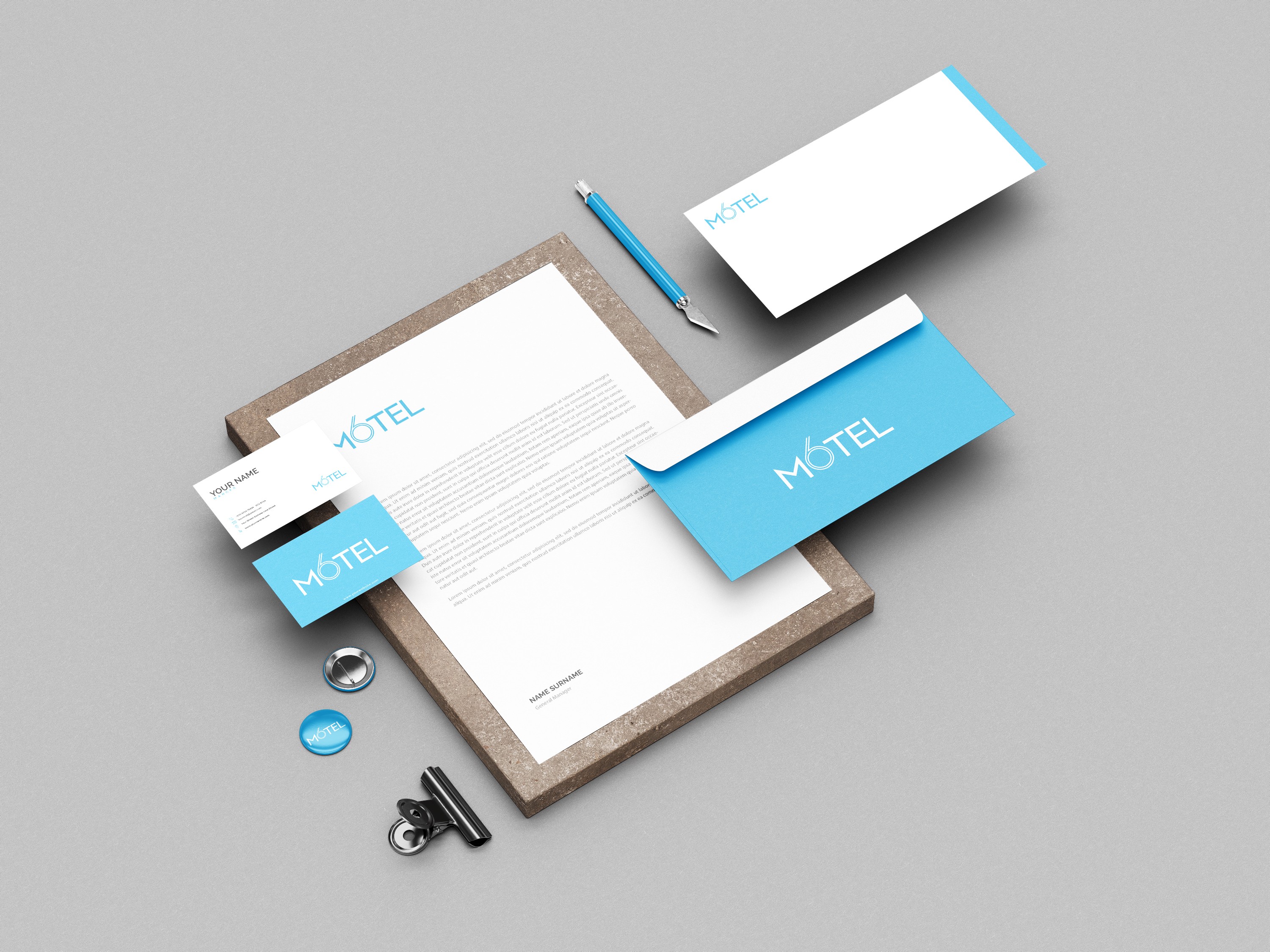
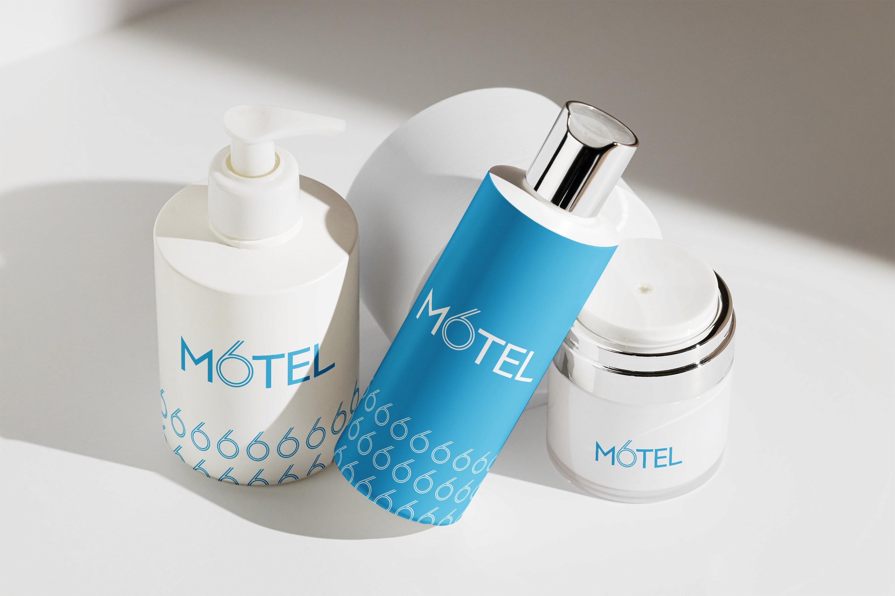
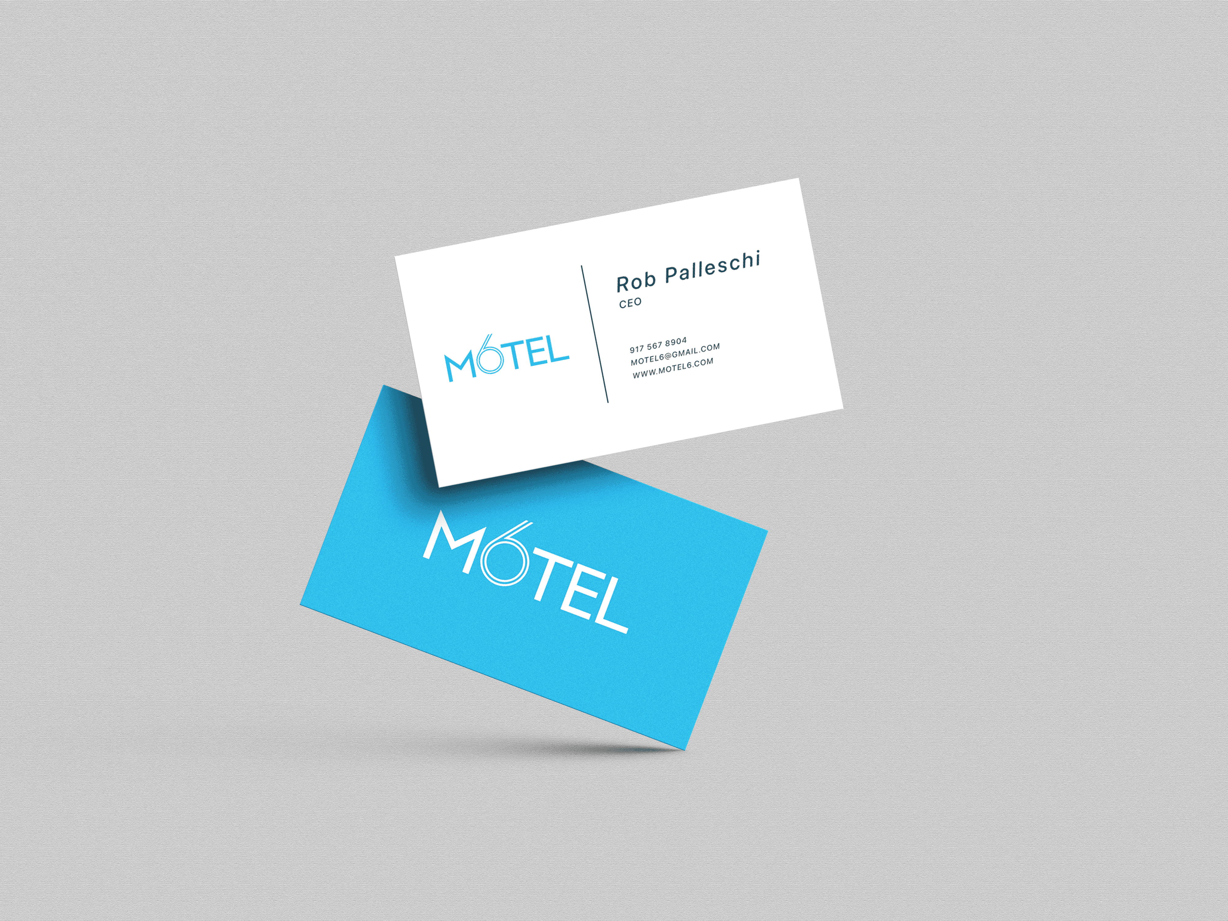
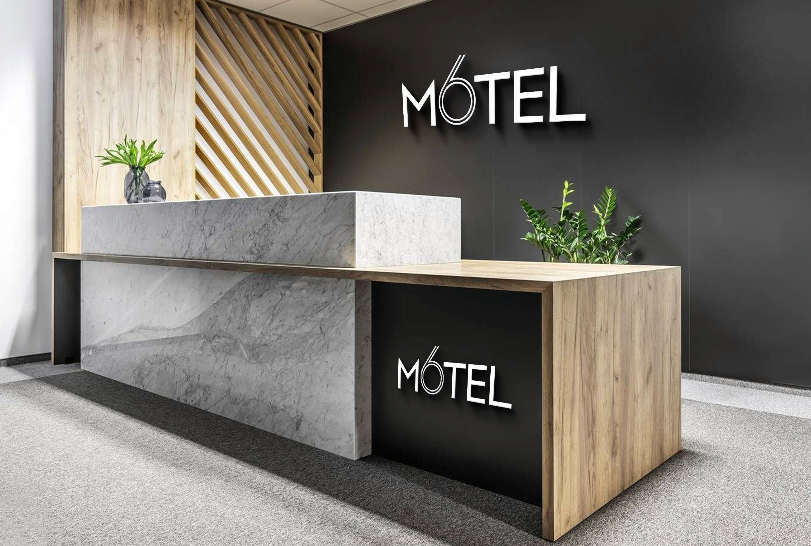
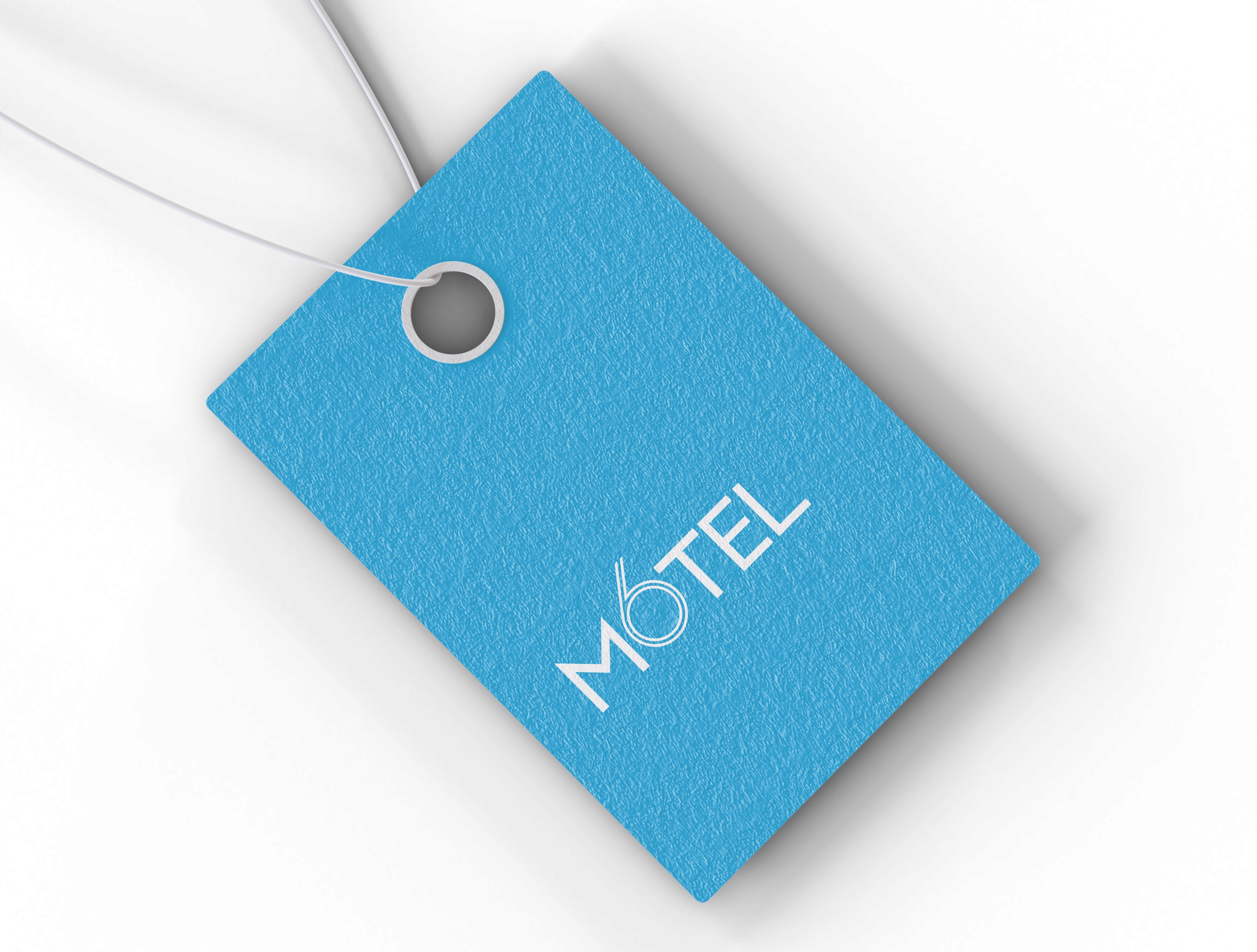
Rebranding Motel 6 with a focus on modernizing and creating a welcoming atmosphere for travelers. The new visual identity incorporates a bold and contemporary color scheme, along with typography that emphasizes the brand’s commitment to a fresh and modern look.
My Role
Branding, Art Direction
Timeline
Nov 2022
Tools
Figma, Illustrator, Photoshop

Problem
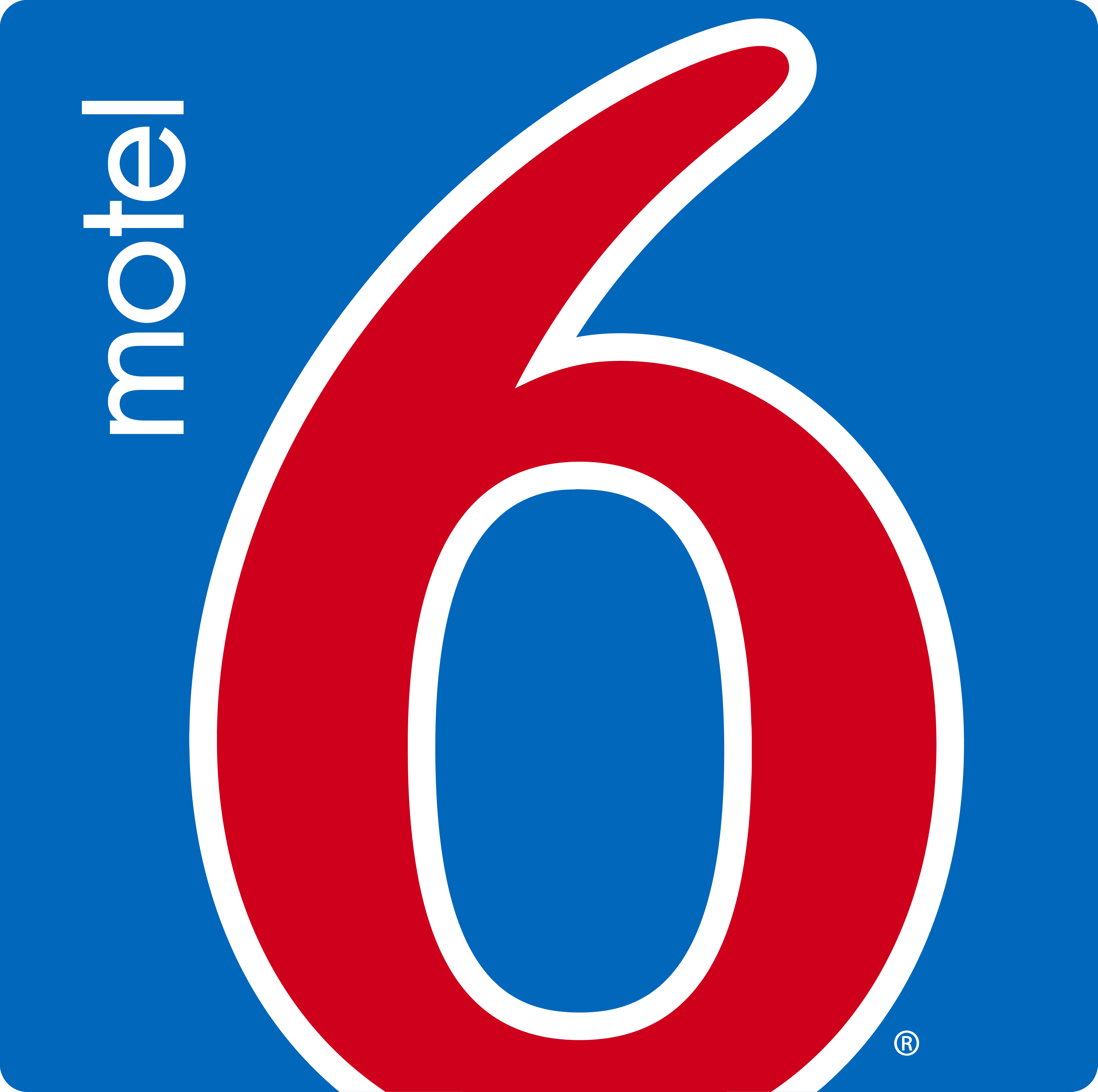
One of the biggest problems with Motel 6’s branding was its outdated logo.
The previous logo featured a large, blocky “6” in red font with the word
“Motel” in small letters above it. The logo was not visually appealing and
did not accurately reflect the company’s values or target audience.
Furthermore, it was not memorable and did not differentiate Motel 6
from other budget hotel chains in the market.